Why this problem matters
People want connection more than ever, yet struggle to actually build it.
Loneliness has increasingly been described as a public health issue, not because people are alone, but because meaningful, recurring connections are missing.
People actively look for connection through shared activities and hobbies. Yet a gap remains between wanting that connection and actually making it happen.
To understand the need and the potential of the idea better, I went into research.
Research
3 interviews. 21 survey participants. Three different insights.
Participants were recruited from my personal network and online communities, screened for having recently moved to a new city or actively tried to build social connections through hobbies.
Interview insights
Life stage, commitment level, and motivation came up repeatedly. People weren't just looking for someone with the same hobby. They were looking for someone at the same point in life.
→ Fit determines whether a connection lasts.
Survey findings
built casual acquaintances through a shared hobby
formed even close friendships through a shared hobby
→ Hobbies are already the main path to real connection for many people.
Survey findings
name uncertainty about taking the first step as the biggest barrier
→ The barrier isn't interest. It's the first step.
Persona
Sarah: the user at the centre.
Sarah, 33
Data Science Consultant, recently moved to Hamburg
She wants to meet new people through shared activities, but hesitates in unfamiliar group situations.
- Recently moved, social network reset
- Looks for connection through hobbies (K-Pop, Escape Rooms, Hiking)
- Needs situations to feel safe before acting
- Sees events she'd enjoy, but doesn't go
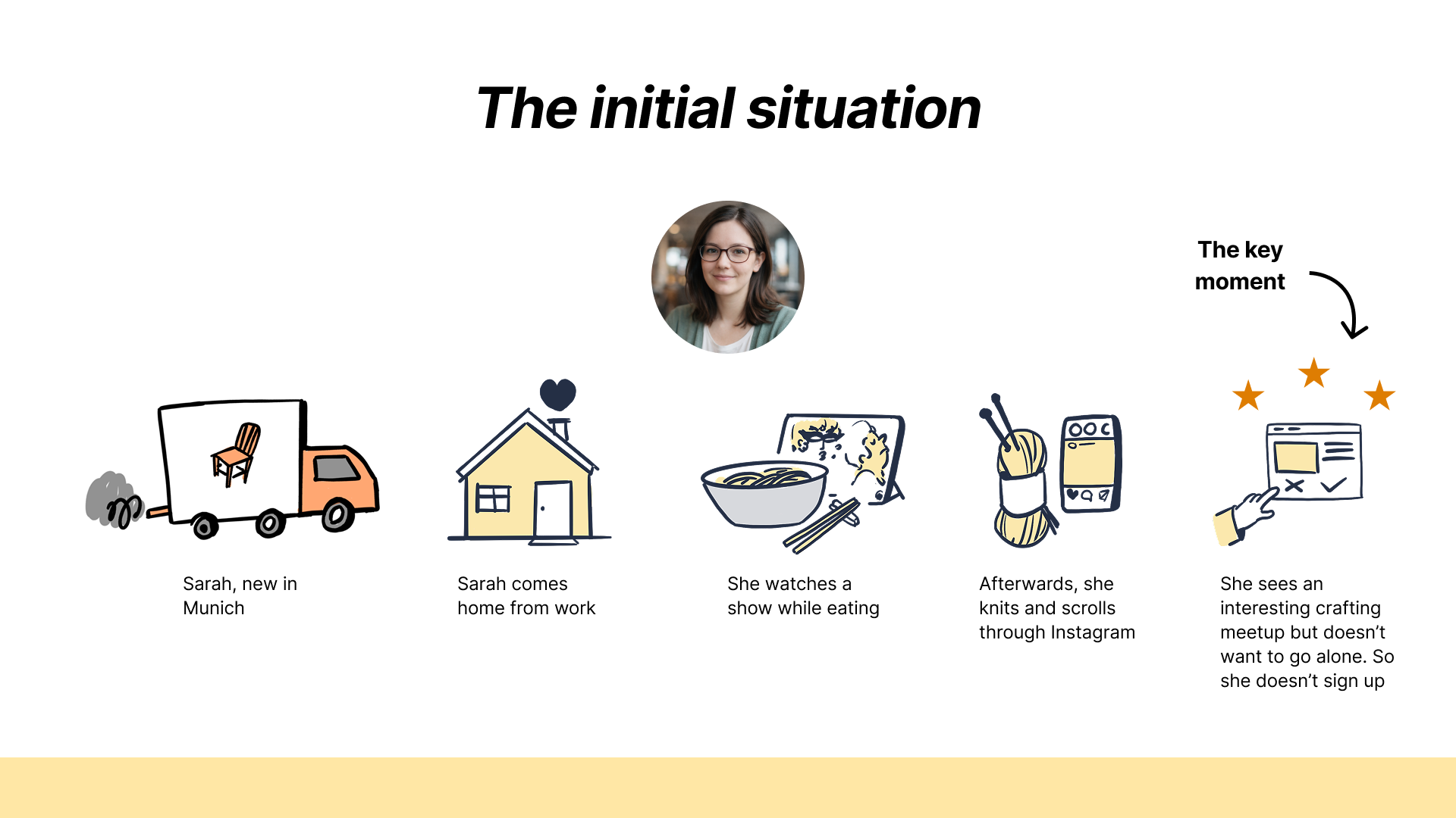
The critical moment: Sarah sees an event she'd enjoy, but doesn't go.
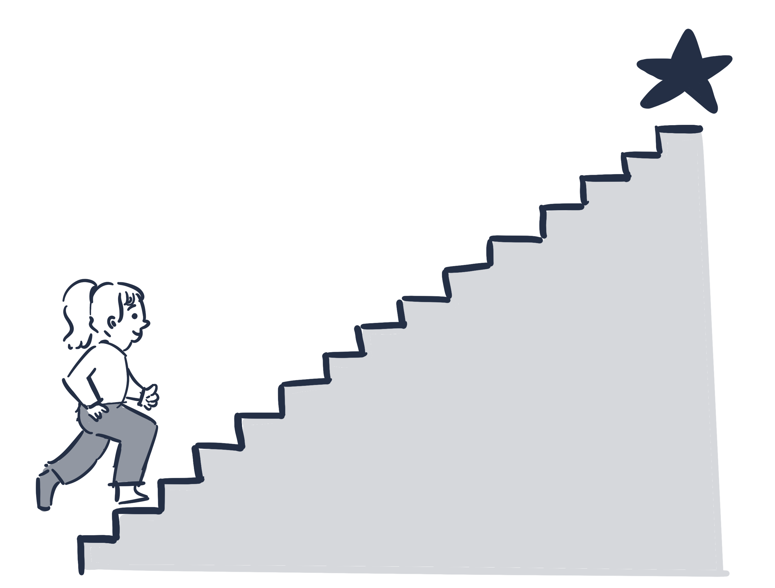
These findings didn't just answer the original question. They changed it.
From Insight to Decision
How research shaped the product.
| Insight | Decision |
|---|---|
| People don't want to show up to events or meetups alone. | Match with a buddy first, then go together. |
| People want someone to share their hobby with, not just attend events. | Hobby-based matching, not event-based. |
| A shared hobby is not enough. Context matters. | Profile shows life stage, motivation and availability, not just interests. |
| One-sided effort kills connections. | Features that require both sides to engage. |
Problem Reframing
How the understanding of the problem evolved.
| Assumption | People struggle to find others with shared interests. |
| Research | People are already finding opportunities through events, communities, and platforms. |
| Insight |
People don't struggle to find opportunities. They struggle to act on them. The barrier is not discovery. It is the first step. |
| Opportunity |
What if we reduce the barrier of the first step? |
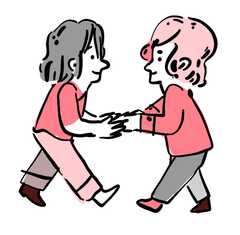
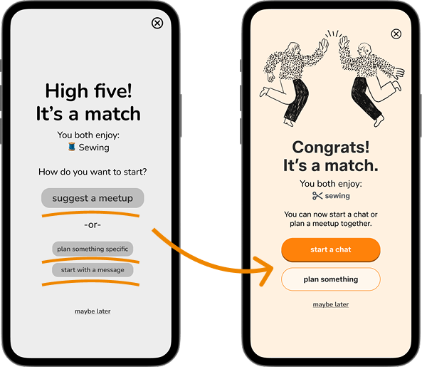
The Solution
Buddy First instead of Event First.
Most platforms are event-first: sign up and hope someone will be there. Buddy First flips this: find your person first, then go together.
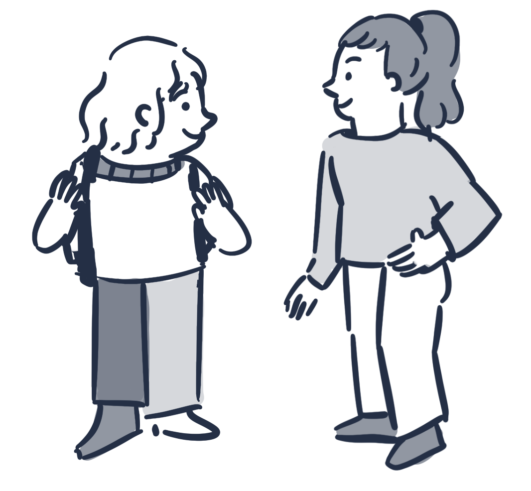
Buddy First ✓
App connects Sarah with a matching activity buddy so she never shows up alone to events, courses, or meetups.
MVP
Users find a matching profile, match, and start a first interaction.
Social Assistant ✗
An AI assistant that encourages Sarah to attend group events alone and approach people there.
Rejected because the focus was connection, not an emotional wellness or anxiety tool. Changing how Sarah feels wasn't the goal. Changing the situation was.
Design Principle
Break large social steps into smaller, manageable actions.
Smaller steps reduce uncertainty. Clarity increases action. People change when the situation changes, not when they're told to act differently. That's the thinking behind Buddy First: not convincing Sarah to be more confident, but making the first step small enough that she actually takes it.
Competitor Analysis
Person-first, not event-first.
Most platforms send people to events and hope for the best. The analysis also surfaced dark patterns that increase anxiety rather than reduce it.
✗
FOMO pressure via missed event notifications
✗
Excessive push notifications
✗
Key features behind paywall
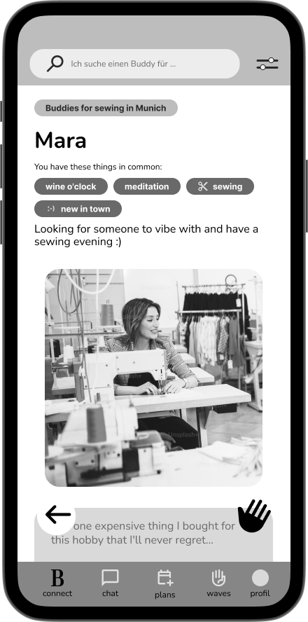
Profile Design
Photo creates interest. Context enables connection.
People make judgements about others within seconds. Research on thin slicing shows these quick impressions are often more about warmth than competence: does this person feel open, friendly, similar to me?
Photos create that immediate first impression. They are the first decision point for Sarah.
Design decision
Design decision: Photo-first layout. The photo is the entry point into every profile. It is the first thing Sarah sees while scrolling, before name or any other context, and what makes her want to read on.
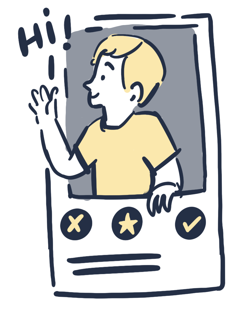
But a photo alone doesn't give someone a reason to reach out. The profile pairs it with short prompts, an icebreaker, life stage and motivation so users can move from "this person looks interesting" to "I could actually write something."
Reactions directly on profile content lower the barrier further: instead of writing a cold first message, Sarah can respond to something already there.
From Concept to Prototype
Structure first, screens second.
The flow defines what the product needs to do. The wireframes translate that into first screens.
User Flow
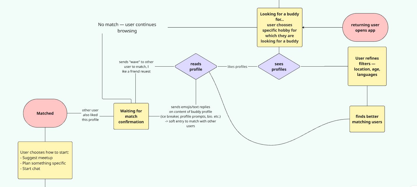
Excerpt from the user flow
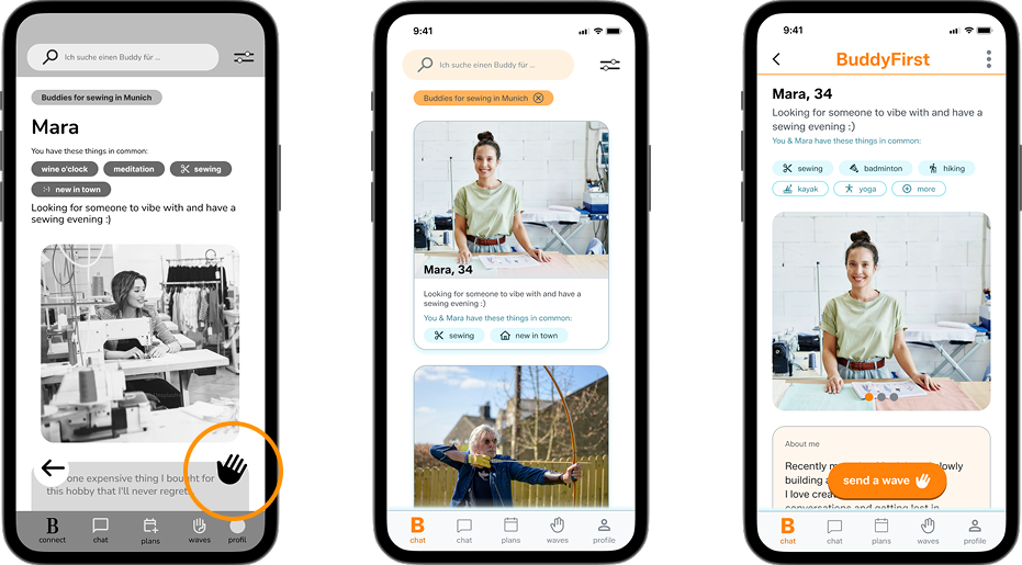
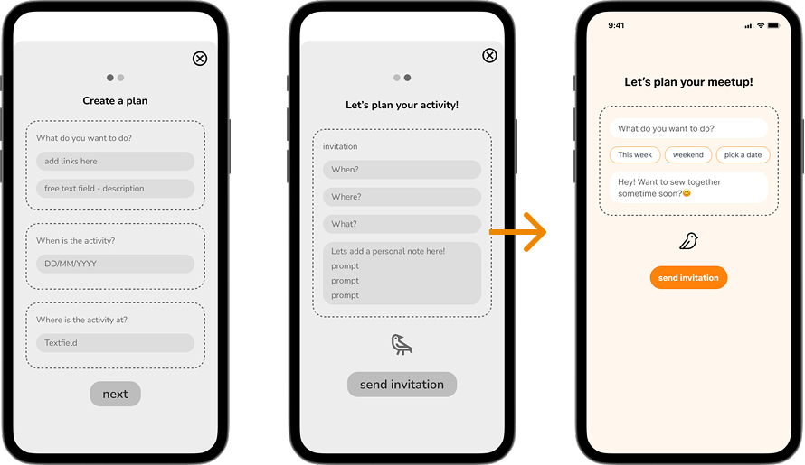
Wireframes
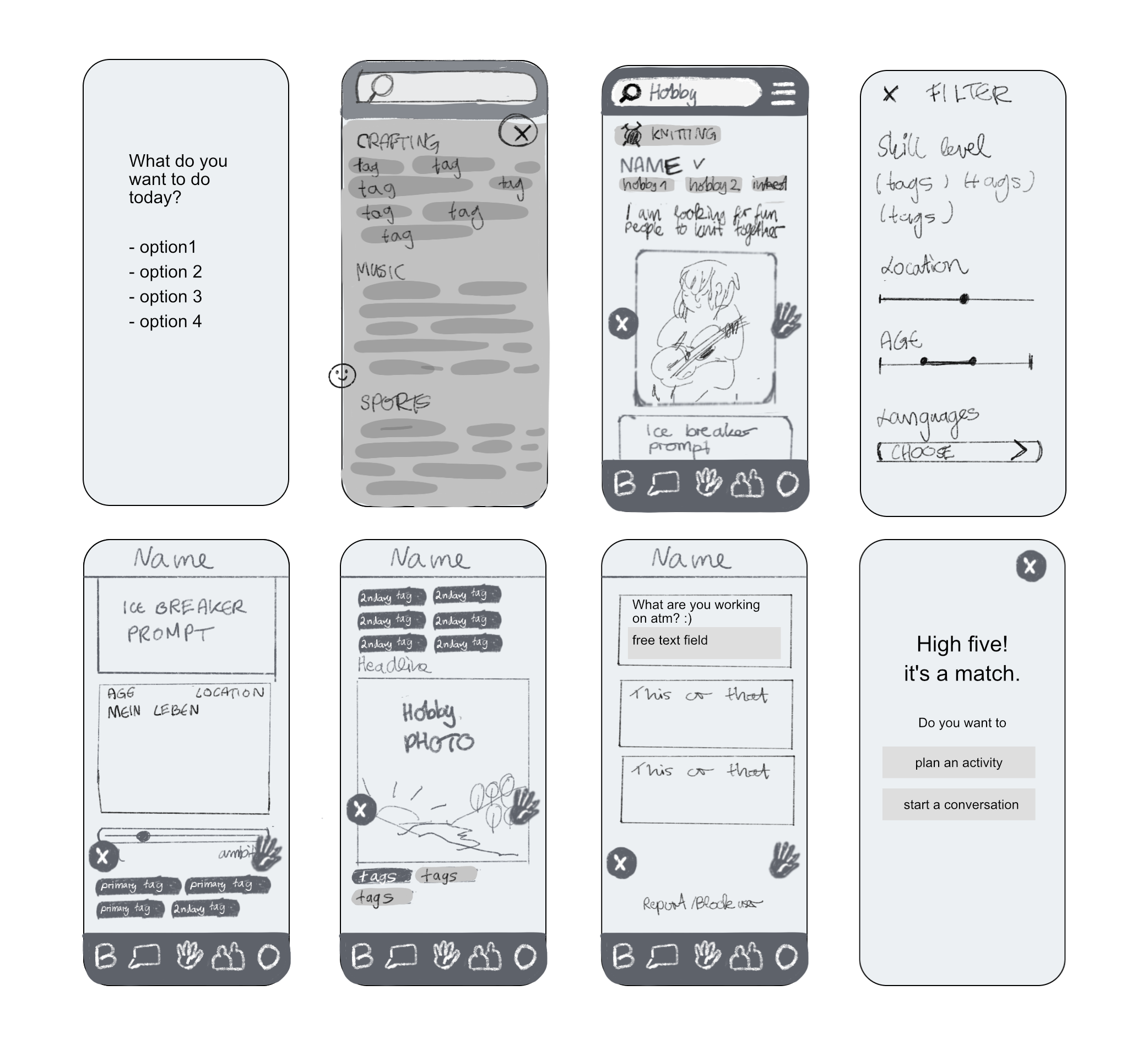
The product in action.
Four screens show the core flow: browse and scroll, filter by context, match, and send an activity invitation.
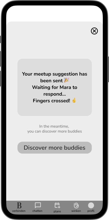
One intentional design decision: after sending an invitation, Sarah can keep browsing rather than sitting with uncertainty waiting for a reply. Uncertainty is when users drop off. Keeping her in motion reduces that moment entirely.
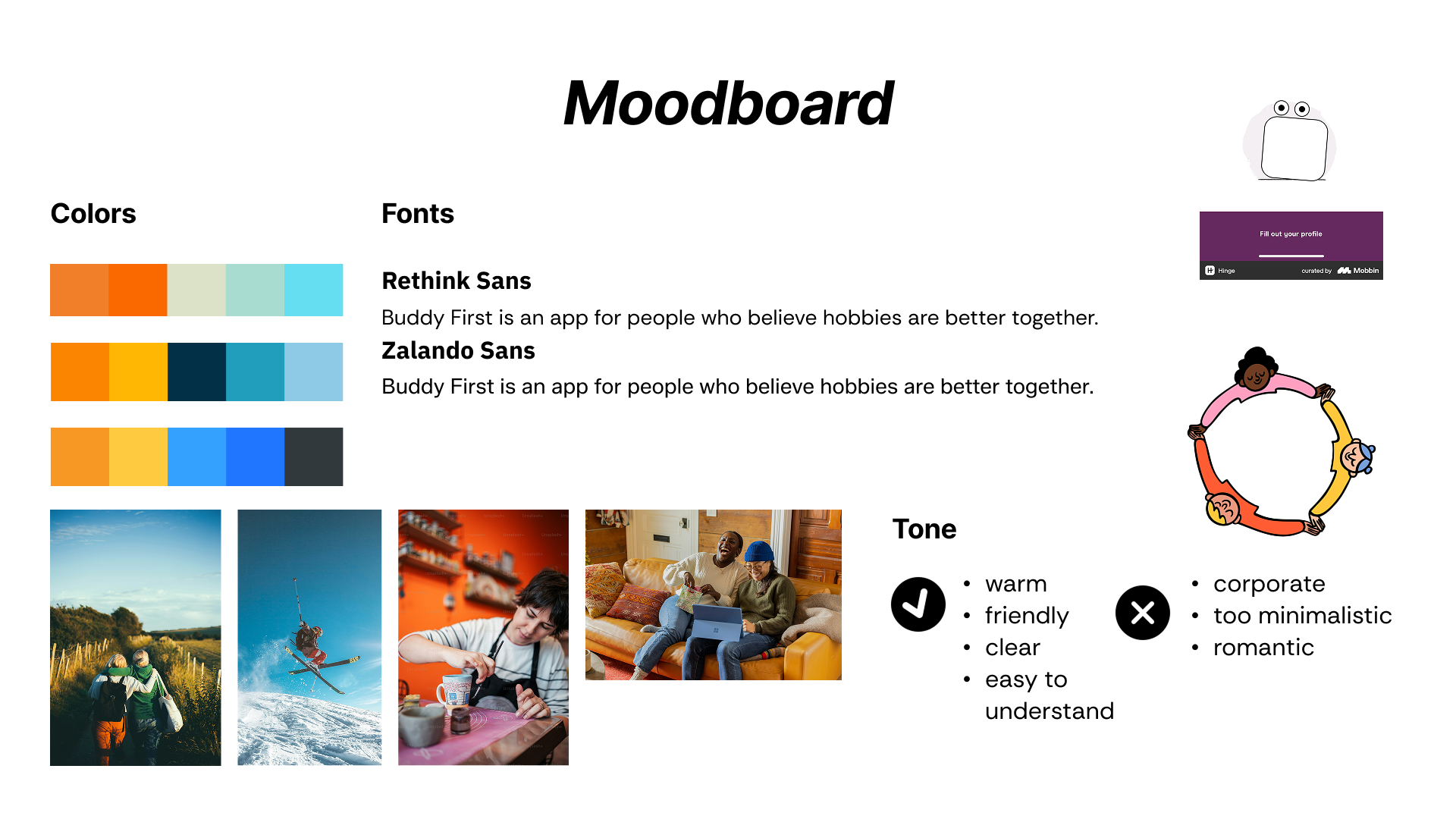
Visual Direction
Warm, approachable, low-pressure.
The visual direction reflects a safe and comfortable social experience. The tone avoids dating-app aesthetics and corporate minimalism. It should feel like something you would actually want to use on a quiet evening.
Usability Testing
Testing assumptions with real users.
Test Goal
Can users independently discover a matching profile, use the match mechanism without help, and choose one of the offered options after matching?
Scenario
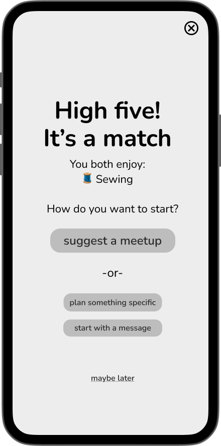
"You just moved to Munich and want to meet someone who also likes to sew and would be up for meeting."
Users were asked to complete the flow Sarah goes through: start a search, explore a profile, get in contact, and after matching, decide how to proceed, all without guidance.
| What worked ✓ | What didn't ✗ |
|---|---|
| Core idea resonated immediately | Next steps not clear, CTA wasn't prominent enough |
| Flow was generally understandable | Profile too long, content not well prioritised |
| Profile content felt relevant and useful | Too many similar options after a match created confusion |
Hypothesis, confirmed with caveats
I assumed users could move through the flow from profile to match to first action independently. The test confirmed this in principle, but showed that clear guidance matters more than many options, and that users need unambiguous next steps or uncertainty kicks in.
What changed
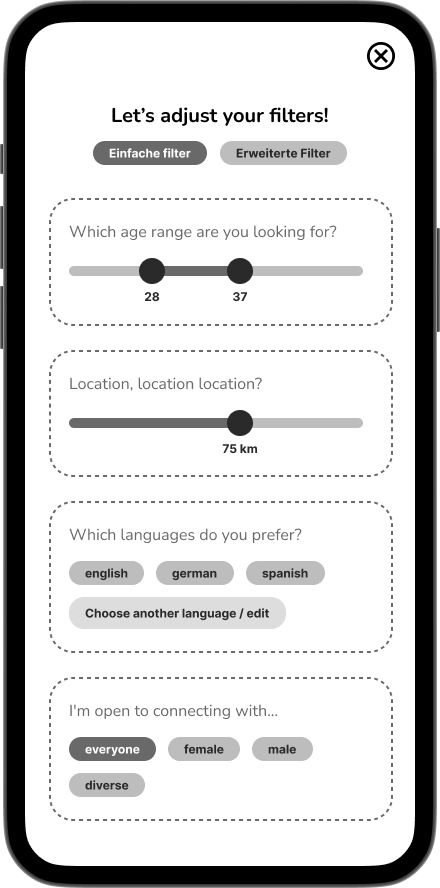
Instead of landing on one profile directly, users now see multiple profiles to browse first
CTA button made visually prominent so the next action is immediately obvious
Post-match options reorganised and reprioritised
Options reduced from 3 to 2, less decision effort, more clarity
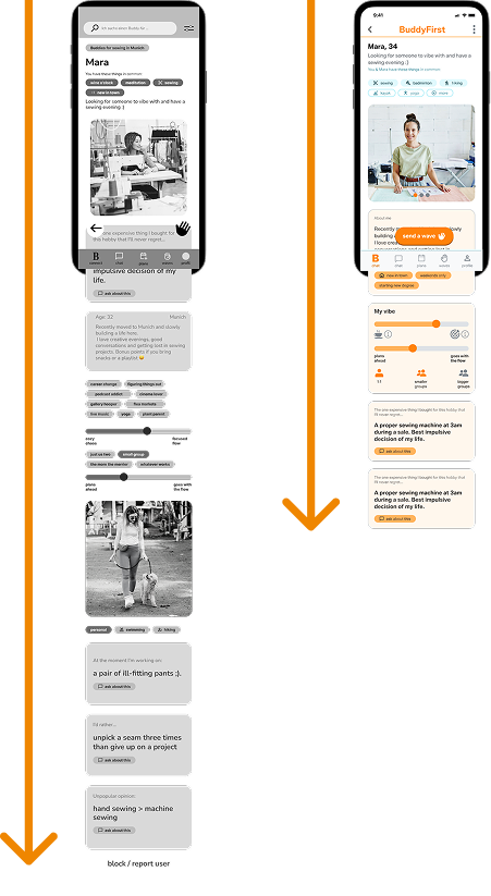
2 screens collapsed into 1, less decision effort, more clarity
Profile length drastically reduced, content reorganised with clearer hierarchy
Prototype
See it in action.
Design Ethics
Design with a stance.
Every design decision has an ethical dimension. I made four commitments from the start.
No FOMO pressure
No notifications about missed events or social pressure tactics
Core features for everyone
No key functionality hidden behind a paywall
Cognitive accessibility
Few decisions at once, clear language, minimal cognitive load
Considered invitations
Matching based on intent, not mass outreach or spam
Success Metrics
How is success measured?
Match to Chat Conversion
A match alone means nothing. What matters is whether it leads to a conversation.
Target: 25% of matches lead to interaction
Tracked via: Event tracking (match_created to chat_started)
Real meetup: In-app survey: "Did you meet up?"
Retention and repeat connection
One meeting isn't the goal. Real success is people coming back to the same person.
Target: 65% complete onboarding, required for quality matching
Tracked via: In-app survey: "Did you go together?" plus repeat match tracking
Next Steps
Where this goes next.
Second round of usability testing
Validate whether the revised profile and the transition from match to first action are now understood more intuitively, without hesitation.
Design the onboarding process
The profile is only as good as what users put into it. Designing an onboarding that feels light enough to complete, but captures the context that makes matching meaningful, is the next open design problem.
More system feedback throughout
Uncertainty spikes when users can't see what their action triggered. More feedback states across the flow would directly reduce that drop-off.
What I learned
Research changes the question: I started with "how do people find others with shared hobbies" and ended up somewhere completely different. The research didn't answer my question. It replaced it.
More options isn't more helpful: I went in wanting to give users as much flexibility as possible. The tests showed that what people actually need is clarity and the right number of choices, not the most choices. Too many options that look similar creates hesitation, not freedom.
Testing reveals what you couldn't predict: I assumed the match-to-action flow was clear. Users showed me it wasn't, not because the logic was wrong, but because clarity and logic are different things.
Ethics isn't a checklist: Writing out the ethical commitments early forced me to make real tradeoffs, not just avoid obvious dark patterns. It changed how I evaluated every design decision after that.